Card
<quiet-card>
Provides a flexible and visually appealing way to organize and present content in a consistent and easily digestible format.
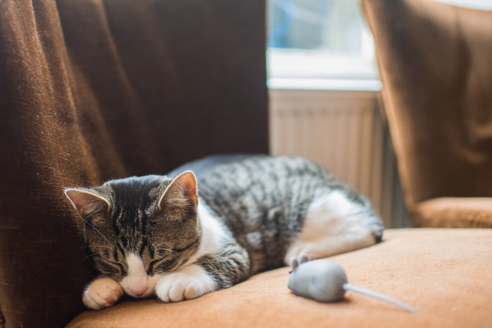
 There's nothing more delightful than watching a curious kitten explore the world with big, innocent eyes
and tiny, playful paws.
<quiet-card style="max-width: 340px;">
  <img slot="media" src="https://images.unsplash.com/photo-1515073883629-5e2924e3e106?q=80&w=1000&auto=format&fit=crop&ixlib=rb-4.0.3&ixid=M3wxMjA3fDB8MHxwaG90by1wYWdlfHx8fGVufDB8fHx8fA%3D%3D" alt="A tabby kitten sleeps next to a toy mouse.">

  There's nothing more delightful than watching a curious kitten explore the world with big, innocent eyes and tiny, playful paws.

  <quiet-button slot="footer" variant="primary">I agree</quiet-button>
  <quiet-button slot="footer">Learn more</quiet-button>
</quiet-card>
Examples Jump to heading
Basic card Jump to heading
Cards are really just styled containers. You can put almost anything in them.
Cats are awesome
A cat is a bundle of energy, always ready for playtime and filled with amusing antics.
The playful nature of a fun cat is contagious, as their curiosity and mischievous behavior make for endless entertainment and laughter.
<quiet-card style="max-width: 340px;">
  <h3 style="font-size: 1.2rem;">Cats are awesome</h3>
  <p>A cat is a bundle of energy, always ready for playtime and filled with amusing antics.</p>
  <p style="margin-block-end: 0;">The playful nature of a fun cat is contagious, as their curiosity and mischievous behavior make for endless entertainment and laughter.</p>
</quiet-card>
With header Jump to heading
Place elements into the header slot to add content at the start of the card. Enabling the
header in vertical cards also enables the actions slot, which is a good place to put relevant
icon buttons.
Fact of the day
<quiet-card style="max-width: 340px;">
  <h3 slot="header" style="font-size: 1.125rem; margin-block: 0;">Fact of the day</h3>
  <quiet-button slot="actions" appearance="text" icon-label="Settings">
    <quiet-icon name="settings"></quiet-icon>
  </quiet-button>

  Playful cats thrive on interaction with their human companions, and their spirited nature can strengthen the bond between them, making for a loving and enriching relationship.
</quiet-card>
With footer Jump to heading
Place elements into the footer slot to add actions or other supplemental information at the end
of the card.
<quiet-card style="max-width: 340px;">
  Playful cats are known for their lively and energetic nature, often engaging in interactive games and activities that stimulate their physical and mental well-being.

  <quiet-button slot="footer" variant="primary">Continue reading</quiet-button>
  <quiet-button slot="footer">More info</quiet-button>
</quiet-card>
With media Jump to heading
Place an image or video into the media slot to add media at the beginning of the card. For
consistency, you can set a custom height on the media and it will be cropped and resized as needed.
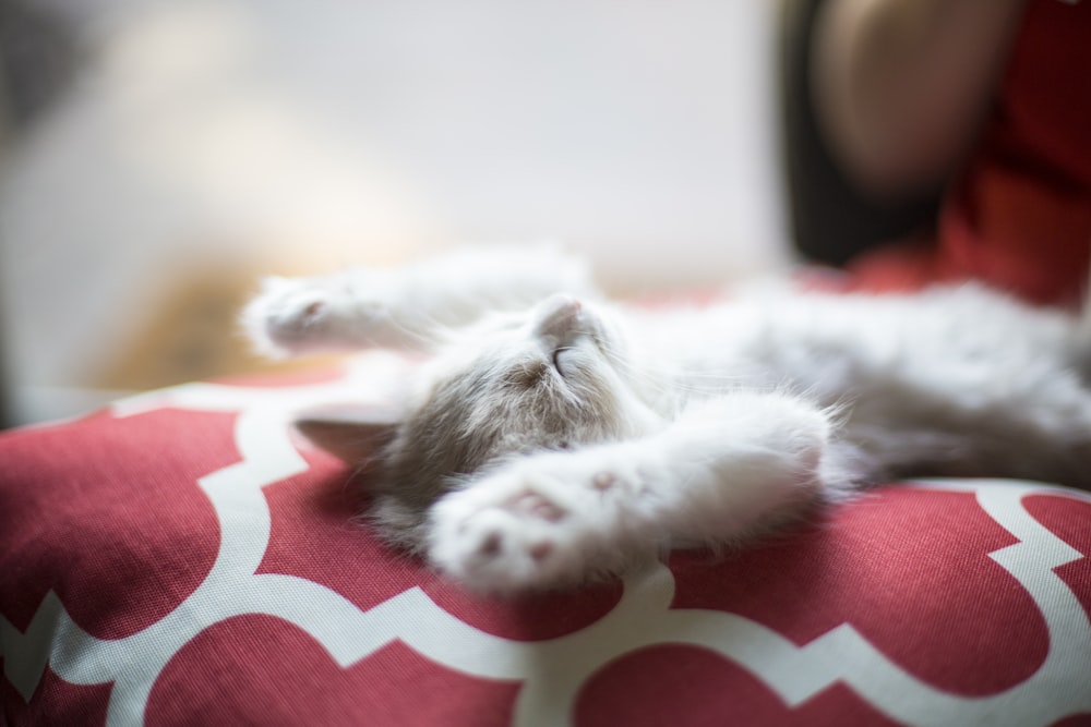
 A young light gray medium-haired cat, with its soft fur and gentle paws, sprawls contentedly on a
vibrant red pillow, basking in the warmth and comfort it provides.
<quiet-card style="max-width: 340px;"> <img slot="media" style="height: 200px;" src="https://images.unsplash.com/photo-1498336179775-9836baef8fdf?q=80&w=1000&auto=format&fit=crop&ixlib=rb-4.0.3&ixid=M3wxMjA3fDB8MHxwaG90by1wYWdlfHx8fGVufDB8fHx8fA%3D%3D" alt="A fluffy kitten sprawls out on a red pillow with its eyes closed and paws in the air."> A young light gray medium-haired cat, with its soft fur and gentle paws, sprawls contentedly on a vibrant red pillow, basking in the warmth and comfort it provides. </quiet-card> <quiet-card style="max-width: 340px; margin-block-start: 2rem;"> <iframe slot="media" height="200" src="https://www.youtube.com/embed/fOd16PT1S7A?si=EOT0GM82FbYsNSzj&controls=0" title="YouTube video player" frameborder="0" allow="accelerometer; autoplay; clipboard-write; encrypted-media; gyroscope; picture-in-picture; web-share" allowfullscreen></iframe> Watching a cute cat video can instantly brighten your day, as you witness the playful antics and adorable expressions of these charming creatures, leaving you with a warm smile and a heart full of joy. </quiet-card> </div>
Changing the appearance Jump to heading
Set the appearance attribute to filled to change the card's appearance.
A cat's purr isn't just adorable, it vibrates at frequencies between 25 and 150 Hz which studies suggest can promote healing and reduce stress in their human companions.
<quiet-card appearance="filled" style="max-width: 340px;">
  <strong>Did you know?</strong>
  <p style="margin-block: .75rem 0;">A cat's purr isn't just adorable, it vibrates at frequencies between 25 and 150 Hz which studies suggest can promote healing and reduce stress in their human companions.</p>

  <quiet-button slot="footer" variant="primary">Amazing!</quiet-button>
</quiet-card>
Horizontal cards Jump to heading
Set the orientation attribute to horizontal to create a card with a horizontal,
side-by-side layout. When using the media slot, be sure to set a width or maximum width on the
image. Horizontal cards do not draw borders to separate the header and footer slots.
 When kittens sleep, they enter a world of peaceful dreams filled with playful adventures and soft purrs.
<quiet-card orientation="horizontal" id="card__orientation">
  <img
    slot="media"
    src="https://plus.unsplash.com/premium_photo-1661676191997-0c0cece2a683?q=80&w=500&auto=format&fit=crop&ixlib=rb-4.0.3&ixid=M3wxMjA3fDB8MHxwaG90by1wYWdlfHx8fGVufDB8fHx8fA%3D%3D"
    alt="Two white kittens laying in a cozy basket">

  When kittens sleep, they enter a world of peaceful dreams filled with playful adventures and soft purrs.

  <quiet-button slot="actions" appearance="text" icon-label="More info" pill>
    <quiet-icon name="dots"></quiet-icon>
  </quiet-button>
</quiet-card>

<style>
  quiet-card#card__orientation {
    container-type: inline-size;

    img[slot="media"] {
      max-width: 180px;
    }

    @container (max-width: 500px) {
      img[slot="media"] {
        max-width: 100px;
      }
    }
  }
</style>
Unlike vertical cards, horizontal cards can make use of the actions slot without the header
enabled.
Wrapping with links Jump to heading
You can wrap links around cards to make the entire card clickable. You might need to add custom styles to prevent unwanted colors, underlines, and transitions from leaking into the card. Consider using styles that make it obvious to users that the card is clickable.
<a
  href="https://example.com/"
  target="_blank"
  style="display: inline-block; font: inherit; color: inherit; text-decoration: inherit;"
>
  <quiet-card style="max-width: 340px;">
    Clicking anywhere on this card will take you somewhere because it's surrounded by a link.
  </quiet-card>
</a>
If you wrap a card with a link, avoid nesting buttons, form controls, links, videos, and other interactive content inside of the card.
API Jump to heading
Importing Jump to heading
The autoloader is the recommended way to import components but, if you prefer to do it manually, the following code snippets will be helpful. Please remember to purchase a license if you're using this in a commercial application.
To manually import <quiet-card> from the CDN, use the following code.
import 'https://cdn.jsdelivr.net/npm/@quietui/quiet-browser@1.1.1/dist/components/card/card.js';
To manually import <quiet-card> from npm, use the following code.
import '@quietui/quiet/dist/components/card/card.js';
Slots Jump to heading
Card supports the following slots. Learn more about using slots
| Name | Description |
|---|---|
| (default) | Content to place in the dialog's body. |
header
|
Content to place in the dialog's header. |
actions
|
Slot in one or more text buttons to add actions to the card's header (vertical) or footer (horizontal). Only available when the respective header/footer is enabled. |
footer
|
Content to place in the dialog's footer. |
Properties Jump to heading
Card has the following properties that can be set with corresponding attributes. In many cases, the attribute's name is the same as the property's name. If an attribute is different, it will be displayed after the property. Learn more about attributes and properties
| Property / Attribute | Description | Reflects | Type | Default |
|---|---|---|---|---|
appearance
|
Determines the card's appearance. |
|
'normal'
|
'normal'
|
orientation
|
The card's orientation. |
|
'horizontal'
|
'vertical'
|
CSS custom properties Jump to heading
Card supports the following CSS custom properties. You can style them like any other CSS property. Learn more about CSS custom properties
| Name | Description | Default |
|---|---|---|
--spacing |
The spacing to use throughout the card. |
1.5rem
|
--border-width |
The width of the card's border, including interior borders. | |
--border-style |
The style of the card's border. |
CSS parts Jump to heading
Card exposes internal elements that can be styled with CSS using the selectors shown below. Learn more about CSS parts
| Name | Description | CSS selector |
|---|---|---|
body |
The container that wraps the card's body. |
::part(body)
|
header |
The container that wraps the card's header. A flex container, by default. |
::part(header)
|
footer |
The container that wraps the card's footer. A flex container, by default. |
::part(footer)
|
media |
The container that wraps the card's media. |
::part(media)
|


